Link to github issue: Rockstor UI: Certificate interface · Issue #2259 · rockstor/rockstor-core · GitHub
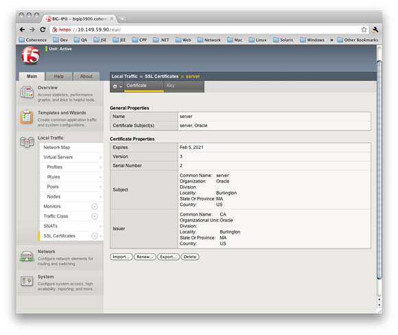
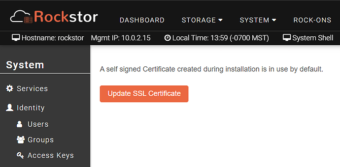
As stated in the Github issue, the Certificate interface in the Rockstor UI could really use some improvement. Most web interfaces that show certificates show some basic information, such as presented in the screenshot linked. For sake of completeness, I will include an image here as a representation of basic certificate information and compare against the current Rockstor UI.
Current SSL certificate details
Proposed SSL certificate details
Some notes. These images are from a F5 appliance but most web-driven interfaces dealing with SSL certificates will generally show this type of interface.
From System> SSL Certificate
Show a list of installed certificates, such as in this example. Clicking on one drills into it (see below)
When drilling into a certificate shown above, show some specific useful information about the certificate, as shown here.

I would still leave the UPDATE SSL CERTIFICATE button, just at the bottom of the display(s).
Hope this makes sense. I am borrowing a completely different user interface but as noted, most user interfaces use the same way of presenting SSL information, as shown above (ie: it’s common.)

